Component families usually begin with one clean section and one innocent prop. Then another layout needs a different media relationship, another needs a stacked list, another needs unequal emphasis, and the component accumulates switches until no one knows which combinations are valid.
Payload makes that problem visible in two places. The React component gets a prop explosion, while the editor gets a field explosion. A single block asks people to choose layout, media mode, density, alignment, emphasis, and theme even though only a handful of combinations were ever designed.
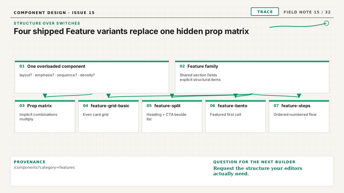
My rule is simple: content-level variation stays in fields; structural variation becomes a named registry item.
Identify a structural change
A structural change alters the section's hierarchy, spatial relationship, medium, or interaction. Examples include a feature grid versus a sequential steps layout, a split composition with its heading and CTA beside a stacked feature list, or pricing cards versus an enterprise comparison.
A content change preserves the structure while varying what is present. An optional eyebrow, extra feature item, secondary link, or alternate image is usually content-level. These values belong in the Payload schema so an editor can tell the same kind of story with different material.
The test is not “can CSS implement it with a class?” CSS can implement almost anything behind a prop. Ask whether the editor is choosing a different content structure with different requirements. If yes, name it.
The architecture documentation describes this family model for the registry.
Suffix every registry variant
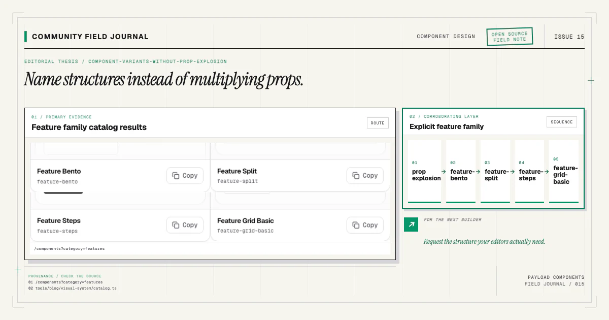
A family member always carries a structural suffix: feature-grid-basic, feature-split,
feature-bento, or feature-steps. Do not ship a bare feature item and later discover that it
actually meant one arbitrary layout.
Suffixes keep every contract aligned:
- the registry name identifies the selected structure;
- the manifest owns a precise file set and wiring key;
- the block slug becomes a stable discriminator;
- generated types name one union member;
- the renderer map points at one component;
- docs and visual baselines refer to the same design.
Selection happens in the component catalog, where people can see the structure. The CLI receives the final name. It does not ask an interactive variant question that is hard to record in automation or reproduce from a pull request.
Do not make editors reconstruct the design system
An overloaded block might expose layout, columns, mediaPosition, cardStyle, showBackground,
and alignment. Each field appears flexible. Together they create dozens of theoretical states,
many with poor hierarchy or broken responsive behavior.
Editors should choose a meaningful section and manage its content. They should not need to know which five settings recreate the approved “Bento features” structure. A named block gives them one previewable choice and a smaller field model.
This does not eliminate flexibility. Within feature-bento, items can vary, copy can be concise or
detailed, links can be optional, and media can use the declared field contract. The important
combinations remain designed and tested.
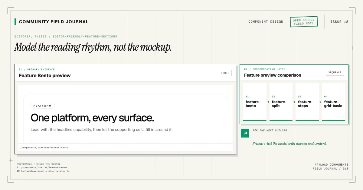
The editor-friendly feature guide compares the narrative jobs of grid, split, steps, and bento structures.
Keep React props close to generated content
When a variant is separate, its component props can come from its generated Payload type plus a small wrapper contract:
type Props = FeatureBentoBlock & {
  className?: string
  disableInnerContainer?: boolean
  id?: string
}
There is no union of unrelated presentation modes inside the component. TypeScript does not need to express rules such as “the first item leads only in Bento unless the layout is compact.” The Payload config and generated interface describe one valid structure.
Wrapper props remain optional because the page renderer may need section anchors, local classes, or full-bleed behavior. Preserve them across variants so the family composes consistently.
Share content vocabulary without sharing the whole component
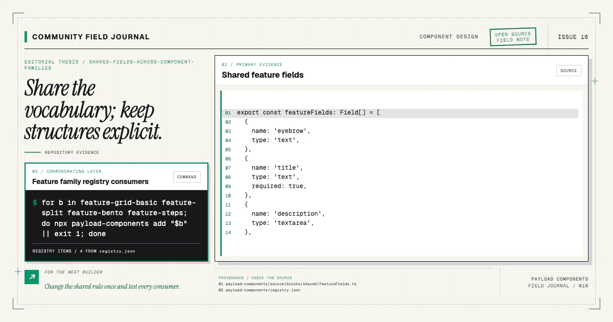
Separate variants do not require duplicated fields. A family can ship a real shared source module:
export const featureFields: Field[] = [
  { name: 'eyebrow', type: 'text' },
  { name: 'title', type: 'text', required: true },
  { name: 'description', type: 'textarea' },
]
Each config spreads the shared fields and adds its structural requirements. Each registry item and manifest includes the shared file. This preserves one editorial vocabulary without merging runtime components or pretending variants have identical data.
The detailed shared-fields article covers file delivery and generated types.
Accept some duplication when it protects clarity
Developers often create a universal component to avoid repeating twenty lines of markup. The abstraction can cost more than the duplication when variants need different semantics, responsive order, client boundaries, or accessibility behavior.
Share stable primitives: container, link handling, rich text, media rendering, and genuinely common field definitions. Keep structural markup in the variant. Two readable sections are easier to change than one renderer filled with conditional branches whose interactions require a truth table.
The registry's demo twins reinforce this choice. Every variant has a dedicated preview and visual baseline. A change to one structure should not unexpectedly alter five modes hidden inside a single component.
Test the family, not merely each file
Per-variant tests should verify source, manifest, registry delivery, installation, docs, preview, and visual baseline. Family-level review should check naming, shared-field consistency, wrapper props, and whether two variants are genuinely distinct.
Avoid variants that differ only by a color token or a small spacing choice. Those belong in the consumer's design system. Conversely, do not collapse variants whose content order or interaction is materially different just because they share a heading.
A catalog is most useful when every entry answers a clear structural need. More names are not the goal; better decisions are.
Evolve a family deliberately
When a new request arrives, begin with real content and a responsive sketch. Compare it with existing variants. If optional fields can satisfy the request without confusing current editors, extend the content model. If it changes hierarchy or requirements, add a suffixed variant end to end.
Use the repository template so source, manifest, registry, docs, demo, and installer tests land together. Then install the existing baseline to understand the family conventions:
npx payload-components add feature-bentoIf your project exposes a combination that the current family cannot express, bring the page job, content shape, and breakpoint behavior to the contributing guide. A concrete case makes it possible to decide whether the durable answer is a field, a shared primitive, or a new structural variant—without returning to one component that claims to be everything.