The right hero is the smallest structure that communicates the page's first decision. That may be a heading, a sentence, and one link. It may need proof, product media, or a second path. It rarely needs every option a design system can imagine.
I choose hero structure from content constraints before visual treatment. What must a visitor understand? What can they do next? Is media evidence or decoration? Who will maintain the content? Those answers produce a more durable Payload model than starting with a fashionable screenshot.
The current registry ships hero-basic as the stable baseline. The same decision framework applies
as the family grows: every materially different structure should become a suffixed item with its own
schema, preview, and tests—not another mode hidden inside one overloaded block.
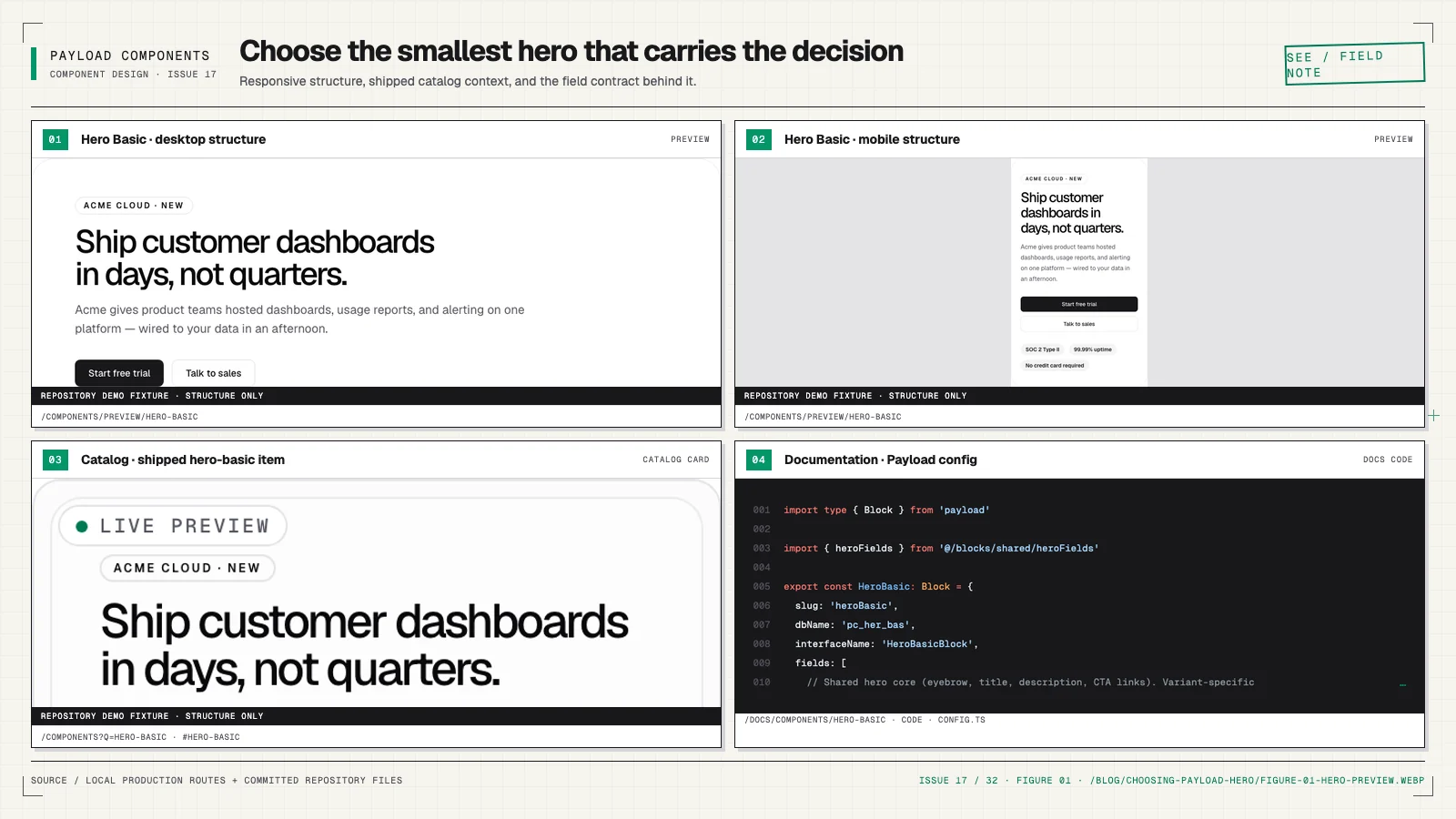
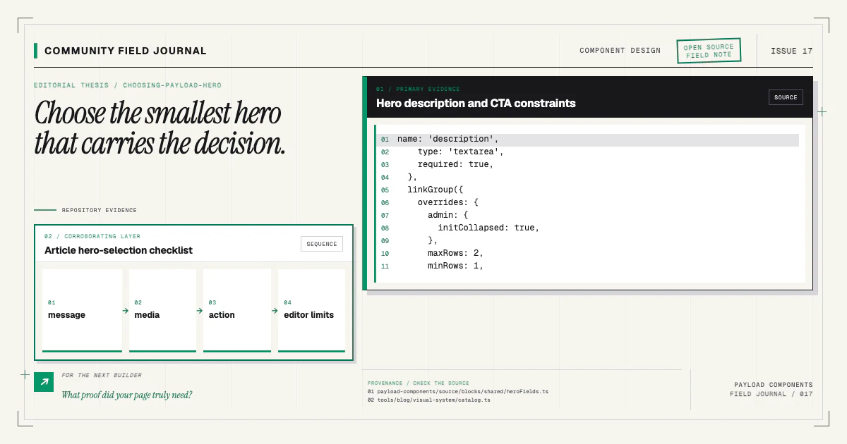
Begin with the message hierarchy
Write the eyebrow, heading, supporting sentence, and primary action before choosing media. If the heading requires three clauses and the paragraph explains four products, the information architecture needs work; a more elaborate layout will only decorate the confusion.
A strong baseline hero answers three questions quickly:
- What is this page or product?
- Why should this reader care?
- What is the next sensible action?
An eyebrow can supply category or context. The heading carries the promise. Supporting copy makes the promise concrete. The primary link advances the reader. A secondary link is useful only when a genuinely distinct path deserves equal visibility.
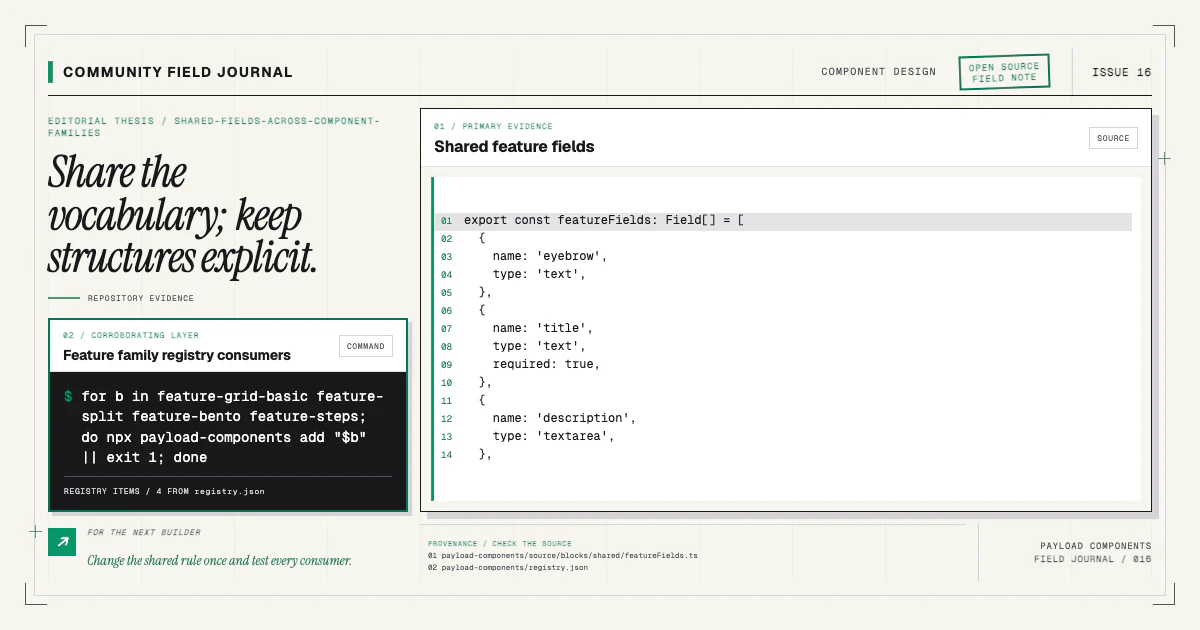
Model those meanings as fields. Avoid asking the editor to choose font size, arbitrary alignment, or padding. The production-ready config guide explains how content-first fields keep the schema stable.
Decide whether media proves something
Product UI, a diagram, a before-and-after image, or a short demonstration can make the promise credible. Decorative stock imagery often consumes the hero's largest area without adding information.
If media is essential evidence, its structure deserves explicit treatment: responsive aspect ratio, alt text, focal behavior, loading priority, and a sensible state when the asset is absent or still processing. A hero where video is the primary medium has different performance and accessibility requirements from a text-led baseline. That is a good reason for a separate structural variant.
If media is optional decoration, do not make the heading layout collapse when it is missing. Test the no-media state as a first-class composition. Editors will eventually publish it.
For uploaded media, account for Payload relationship depth and access. The renderer may receive an ID instead of a populated media document. Narrow the value rather than asserting the rich shape.
Match actions to page intent
A homepage hero can offer product exploration and documentation. A campaign page may need one focused conversion. An open-source project may point to installation and contribution. The block should not hard-code a business-specific button label or assume every link is external.
Use the site's shared link field model and renderer. Validate allowed link types, preserve accessible labels, and avoid nested interactive elements. A hero link should be a link when it navigates; do not render it as a button only because it looks prominent.
Limit the action count. Three or four equal buttons force a visitor to solve the site's navigation problem inside the first viewport. Move lower-priority destinations into the header or the next section.
Choose structure by real constraints
Here is the comparison I use when evaluating a family:
| Structure | Best when | Content cost | Main risk |
|---|---|---|---|
| Basic text-led | The promise and action are enough | Low | Generic copy becomes visible |
| Split media | Product imagery materially explains value | Medium | Media dominates weak messaging |
| Demonstration-led | Motion or workflow is the evidence | High | Performance and reduced-motion gaps |
| Proof-led | Credibility is the first obstacle | Medium | Logos or metrics lack context |
| Editorial | Story, mission, or launch moment leads | Medium | Heading hierarchy becomes decorative |
This table describes decision categories, not currently published registry names. I do not want to pretend a component exists before its source, manifest, docs, demo, and tests land. Browse the catalog for what is actually installable today.
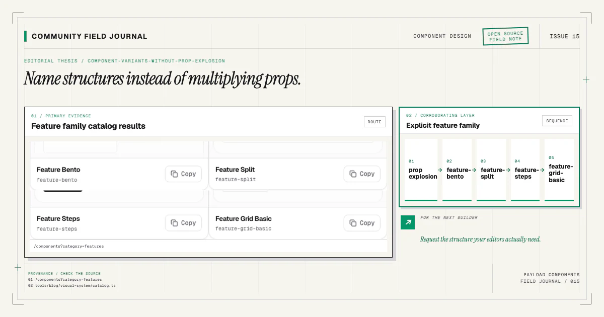
When a new structure earns a component, follow the variant-without-prop-explosion model: suffix the item, keep shared content fields in shipped source, and make selection visual in the catalog.
Design for the editor's real workflow
Field order should match composition order. Put eyebrow, heading, description, and links together. Give media its own group when it carries several properties. Use clear labels and admin descriptions for choices whose consequences are not obvious.
Make required only what the structure truly needs. A missing heading probably invalidates a hero. A missing secondary link should not. If media defines the variant, require it or provide a documented fallback rather than letting the block become a broken copy of another variant.
Preview realistic constraints in the admin where practical, but do not encode critical validation only in custom UI. API-created and migrated documents must follow server-side rules too.
Test content extremes before approving a hero
The polished demo is only one state. I test:
- a short heading and a long two-line heading;
- no eyebrow and an unusually long eyebrow;
- one action, two actions, and no optional action;
- copy with one sentence and copy with several lines;
- missing optional media and a portrait media asset;
- mobile widths with zoomed text;
- keyboard focus on every interactive element;
- reduced motion when animation exists.
Check the section beside multiple following backgrounds. A hero that only looks correct against one
specific next block is not composable. Confirm heading levels in the page context; the hero often
contains the page's h1, so a reusable component must not introduce another.
Visual regression protects the representative state, while browser and integration tests protect
semantics and responsive behavior. The component's demo twin must remain aria-hidden, contain no
interactive controls or headings, and mirror source class names for fidelity.
Treat performance as part of the choice
The first viewport strongly affects perceived speed. A basic hero can render almost entirely as server HTML. A video or elaborate animated composition can add scripts, media bytes, and late layout changes before the reader sees the promise.
Use Next.js image sizing and responsive sources. Reserve media dimensions. Avoid autoplay audio.
Load only motion that communicates. Respect prefers-reduced-motion and ensure the final readable
state exists without animation. The motion guide develops
that implementation contract.
Do not choose the richest hero and attempt to optimize it back into simplicity. Choose the simplest structure that meets the communication requirement.
Know when to add a variant
Add a variant when repeated real pages need a different hierarchy and the difference can be described clearly. Bring representative content, responsive states, accessibility behavior, and the Payload field model. “This screenshot looks nice” is not enough evidence for a permanent registry item.
The complete contribution includes source, manifest, registry entry, documentation, demo twin, installer tests, and visual baseline. If those surfaces feel excessive, the idea may not be stable enough to distribute yet.
Start with the baseline and customize its owned source in your project:
npx payload-components add hero-basicRead the Hero Basic docs, publish it with your actual message, and test the awkward states. If a structural need keeps recurring, open a proposal through the contributing guide with evidence from real content. That is how a hero family grows without turning one block into a matrix of switches.