Feature sections age badly when their content model exists only to fill a launch-day mockup. Six perfectly balanced cards become five. One description grows to three lines. A product manager adds a link to one item, then asks why every other card has an empty button slot.
Maintenance is the design test, not an edge case.
An editor-friendly feature block begins with a repeatable content unit and an honest structural capacity. The layout should tolerate normal editorial change without asking someone to tune CSS through the CMS.
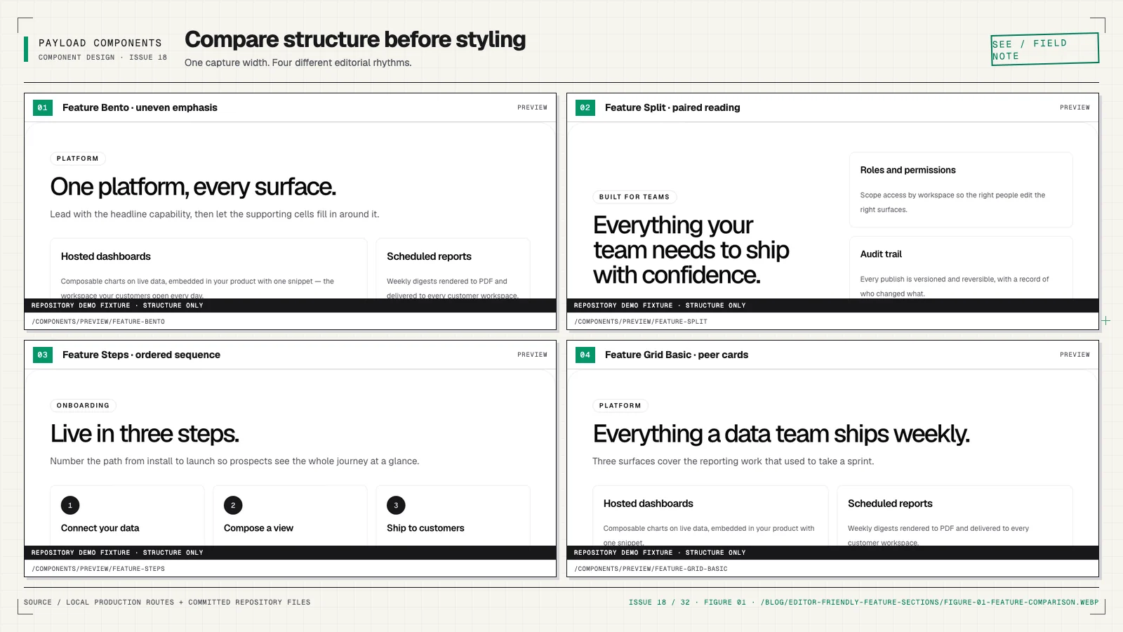
Give each structure a narrative job
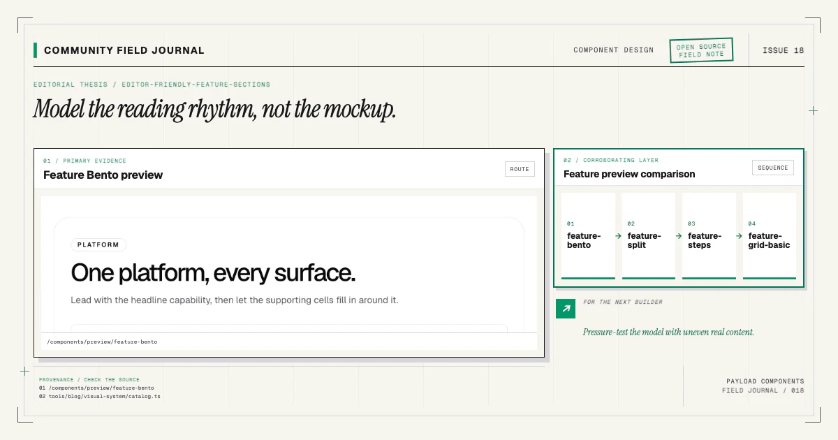
A grid says the items are peers. It is useful for a scannable set of capabilities where no one feature owns the story. A split gives one idea and its media more room, often as alternating rows. A steps structure says order matters. A bento structure creates deliberate hierarchy among a small set of unevenly weighted ideas.
Those are not visual skins for the same data. Order, emphasis, item count, and media requirements
differ. Shipping them as feature-grid-basic, feature-split, feature-steps, and
feature-bento keeps the editor's choice explicit and the React components focused.
Browse their live entries in the component catalog. The variant-design article explains why the CLI does not install one universal feature block with a layout dropdown.
Define the repeatable feature unit
Most feature items need a title and description. Optional fields may include an icon, image, link, badge, or supporting metric. Add only values the component renders with a clear purpose.
{
  name: 'items',
  type: 'array',
  labels: { singular: 'Feature', plural: 'Features' },
  fields: [
    { name: 'title', type: 'text', required: true },
    { name: 'description', type: 'textarea', required: true },
    { name: 'link', type: 'group', fields: linkFields },
  ],
}
Use labels an editor recognizes. “Feature” is better than “Card item” when the content represents a feature. Add admin descriptions for nonobvious constraints, such as the fact that the first bento item receives larger emphasis.
If every item needs a different set of fields, the supposed repeatable unit may be several structures forced into one array.
Set capacities from the design, not convenience
Arrays can have minimum and maximum rows. Use those limits only when the structure has a genuine capacity. A bento composition designed for four or five items should not accept twenty and hope CSS finds a reasonable layout. A plain grid may reasonably accept a wider range.
Test every permitted count. If the schema allows one through eight, preview one, two, three, four, five, seven, and eight at multiple widths. Do not assume the even six-card demo represents the contract.
Avoid requiring filler merely to satisfy symmetry. If a layout only looks complete with exactly six ideas, say so in the field validation and documentation—or choose a more flexible grid.
Keep emphasis structural
Bento layouts often make one or two cards larger. Decide whether emphasis comes from position or an editorial field. Position is simpler: the first item is primary, and the admin description explains it. An explicit importance field can be useful when editors reorder frequently, but it introduces validation: how many primary items are allowed, and what happens if none exist?
Do not expose grid coordinates, column spans, or row numbers as arbitrary editor fields. That turns the content model into a brittle layout language. If several stable emphasis patterns are valuable, they may be separate structural variants.
The CMS should express “this idea is primary,” not “span columns 1 through 7 at large widths.”
Use media consistently
Icons should come from a controlled vocabulary or relation, not raw SVG pasted into a text field. Images need alt-text policy, aspect-ratio behavior, and a fallback. Product screenshots need enough room to remain legible; decorative shapes should not force editors to manufacture accessibility text for meaningless pixels.
For a split structure, media is often essential to the section. For a grid, it may be optional. Reflect that difference in each block config. A universal item schema that marks media optional everywhere pushes structural validity into runtime conditionals.
When a Payload upload can arrive as an ID or a populated document, narrow the relationship in React. Test the configured fetch depth and access behavior instead of casting the rich form.
Make links predictable
If feature items can link, render the title or a clearly labeled action consistently. Avoid making an entire complex card clickable while also placing buttons inside it; nested or competing interactive targets create keyboard and screen-reader problems.
Use the application's shared link model for internal references and external URLs. Validate protocols, add external behavior deliberately, and preserve editor-entered accessible labels. The safe links guide covers the trust boundary in detail.
An optional link should not leave visual residue when absent. A required link should correspond to a real user task, not a desire to keep card heights equal.
Write admin copy as part of the component
Field labels and descriptions are interface design. Tell an editor which item receives emphasis, what media ratio works, whether order communicates a process, and how many items the layout supports. Do not make them reverse-engineer the public CSS.
Group section-level introduction fields separately from the item array. Put heading and description before the list so the admin order matches the rendered hierarchy. Use collapsible rows or concise labels when arrays become long, but keep required values visible.
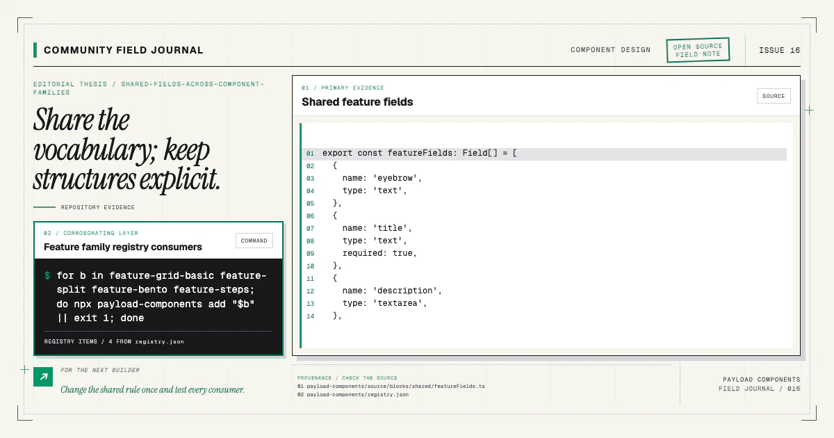
The shared-fields article shows how a family can reuse the same intro vocabulary while keeping each item structure distinct.
Design empty and stress states
A production component needs deliberate behavior for:
- no optional eyebrow or description;
- the minimum item count;
- long translated headings;
- one description much longer than its peers;
- missing optional icons or media;
- links present on only some items;
- maximum rows;
- narrow mobile and zoomed desktop text.
Do not truncate meaningful copy solely to preserve a demo card height. Use layout that can grow, or document a genuine editorial limit with validation. Line clamping can be appropriate for an index preview that links to full content; it is usually a poor default for the feature explanation itself.
Ensure the DOM order matches reading order even when CSS creates a bento grid or alternating split. Keyboard and screen-reader order should not jump according to visual placement.
Let the page context finish the design
Feature blocks need to compose with heroes, proof, pricing, and calls to action. Use semantic design tokens and consistent outer spacing. Avoid hard-coding a top margin that assumes the preceding block or a background that only works in one sequence.
Preserve wrapper props such as id, className, and the inner-container option. They let the page
add navigation anchors or full-bleed treatment without duplicating the component.
Review combinations on a real page, not only isolated preview routes. The guide to building a first landing page provides a practical composition sequence.
Install one, then pressure-test it
Start with the structure that matches your content, not the one with the most visual variety:
npx payload-components add feature-bentoPublish it with actual features, delete an item, double one description, remove optional media, and test the result at mobile and desktop widths. The source is yours, so adapt the field model if your editorial reality differs.
If a recurring content case exposes a weakness in the shared component, bring a sanitized example and the expected responsive behavior to the contributing guide. Useful community improvements often begin with the unglamorous fifth card, missing icon, or translated heading that a launch mockup never showed.