The first landing page I build in a new Payload project is intentionally ordinary. It has a hero, a feature section, a piece of social proof, an FAQ, and a final call to action. That sequence is enough to expose every important connection between Payload and Next.js without burying the lesson under a complicated design system.
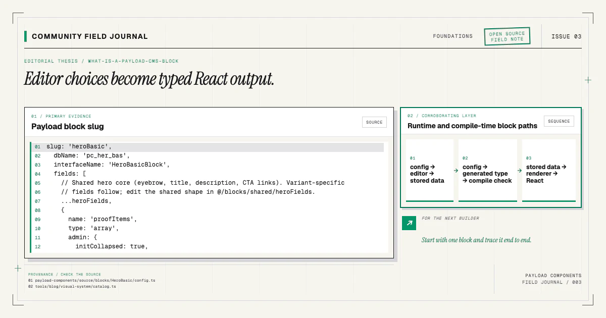
The goal of this guide is not to reproduce one screenshot. It is to leave you with a page model an editor can rearrange, a renderer TypeScript can check, and source code your team owns. We will use the same boundary described in What Is a Payload CMS Block?: Payload stores ordered content, while React decides how that content looks.
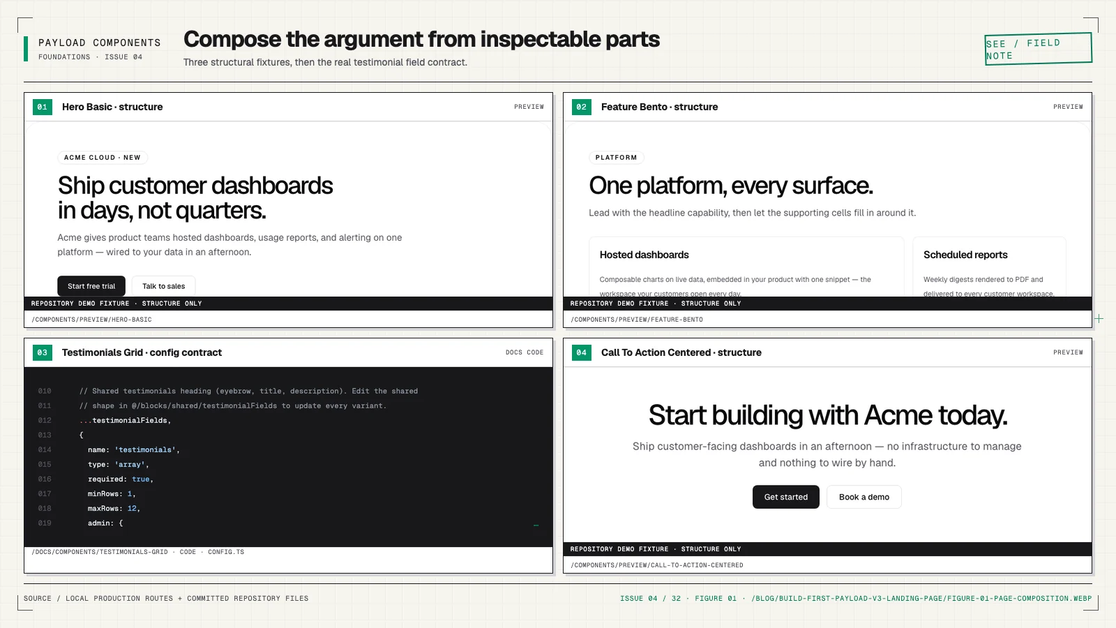
Start with the page's editorial jobs
Before installing anything, write down what each section must accomplish. My baseline sequence is:
- Hero: make one clear promise and offer a primary action.
- Proof: show recognizable customers, outcomes, or a credible quote.
- Features: explain the mechanism in a scan-friendly structure.
- FAQ: resolve the objections that block the next step.
- CTA: repeat the action after the reader has context.
This sequence is not sacred. A product with a visual workflow may need a demo immediately after the hero. A community project may replace customer proof with contribution activity. What matters is that every section has a job. When the job is clear, choosing a block becomes a content decision instead of an aesthetic coin flip.
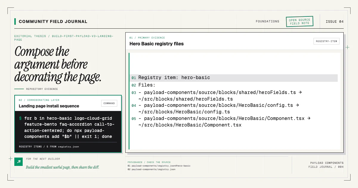
Browse the component catalog and choose one component for each job. For a compact
first build, I like hero-basic, logo-cloud-grid, feature-bento, faq-accordion, and
call-to-action-centered. The catalog shows live demo twins, while each component's documentation describes
the installed files, content model, requirements, and exact wiring.
Install the first block and inspect the diff
Run the installer from the root of a supported Payload v3 + Next.js project:
npx payload-components add hero-basicDo not rush past the output. Open the git diff. You should see copied source under your project,
an import and registration in the Pages collection, a renderer import and map entry, then the
generated artifacts produced by your configured scripts. The command records state under
.payload-components/state.json so a rerun can converge and a partial install can be diagnosed.
The installation guide covers project detection, supported layouts, and the
difference between the companion CLI and a direct shadcn registry install. The useful distinction is
simple: shadcn delivers files; payload-components add also performs Payload-specific wiring. The
Payload blocks implementation guide traces that wiring for the same
hero-basic block from config through collection registration and rendering.
If the first diff is wrong for your repository, stop there. The source remains reviewable, and the installer should fail rather than guess when an expected anchor is ambiguous. A small, honest failure is safer than a broad rewrite of a collection config.
Install the remaining sections
Once the first block lands cleanly, add the rest one at a time:
npx payload-components add logo-cloud-grid
npx payload-components add feature-bento
npx payload-components add faq-accordion
npx payload-components add call-to-action-centered
Installing separately makes each diff easy to understand. It also teaches you the family pattern:
every structural variant is a named registry item. You select it in the catalog, not through an
interactive prompt and not through a giant variant prop after installation.
After each command, confirm three things. The new source files should be in the expected target
paths. The Pages collection should list the block exactly once. The blockComponents map should
contain a matching key exactly once. Idempotency tests protect the supported starter shape, but your
diff remains the final authority in your own project.
Understand the collection edit
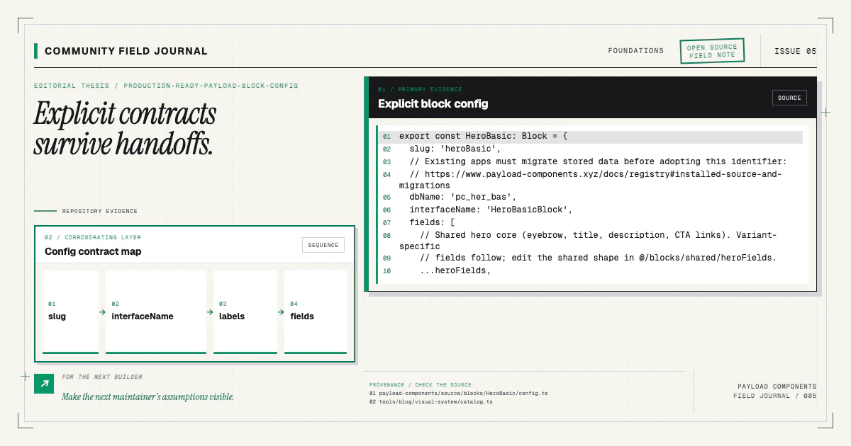
Your Pages collection needs a Blocks field, commonly named layout. Its list of configs defines
what editors may add:
{
  name: 'layout',
  type: 'blocks',
  blocks: [
    HeroBasic,
    LogoCloudGrid,
    FeatureBento,
    FaqAccordion,
    CallToActionCentered,
  ],
}
Payload's Blocks field documentation is the primary
reference for the field API. Notice that order in this config controls chooser presentation, not the
published page order. Editors create the actual sequence by arranging saved entries in layout.
Use access control and versions on the Page collection according to your application, not according to a component example. Blocks participate in the collection's draft, localization, and access behavior; they do not bypass it. If the site uses drafts, make sure the frontend fetch respects the preview or published state you intend.
Make the renderer explicit
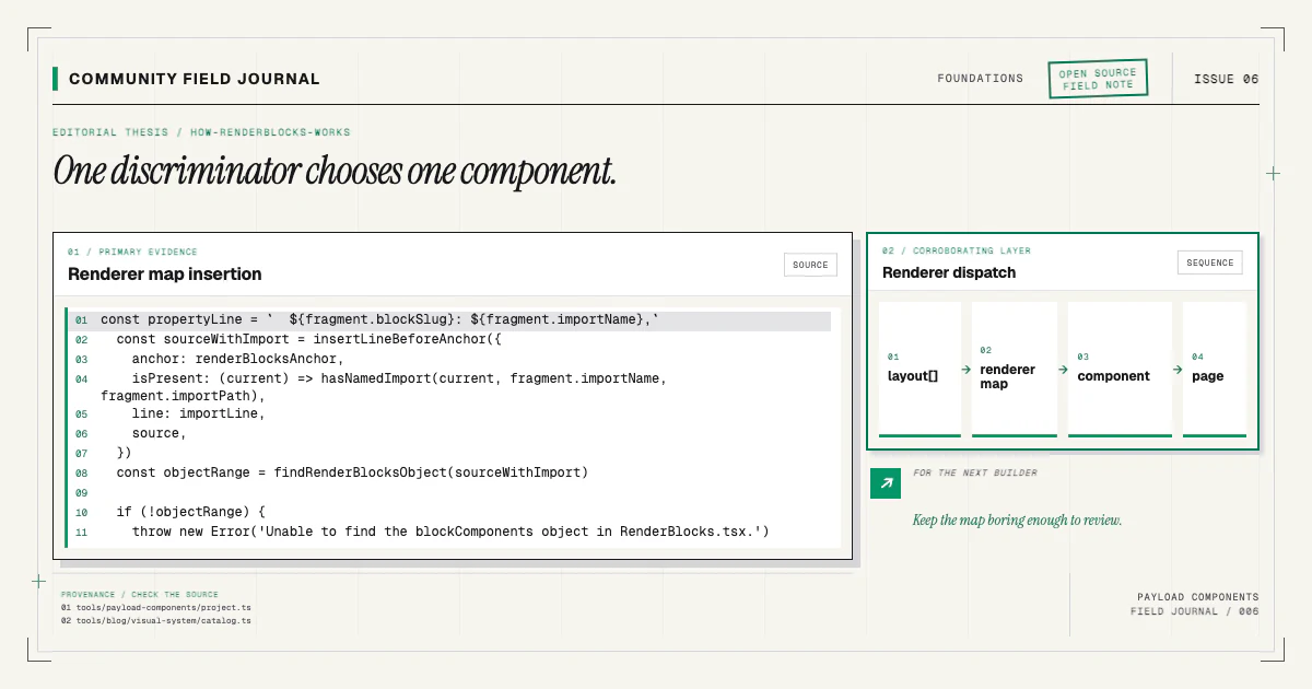
The renderer is a small boundary with a large debugging value. Keep the mapping easy to inspect:
const blockComponents = {
  heroBasic: HeroBasicBlock,
  logoCloudGrid: LogoCloudGridBlock,
  featureBento: FeatureBentoBlock,
  faqAccordion: FaqAccordionBlock,
  callToActionCentered: CallToActionCenteredBlock,
}
Then iterate over the saved layout, look up each component, and pass the narrowed block data. I also
recommend reporting an unknown blockType in development instead of silently dropping it. A stale
document or missing map entry is much faster to fix when the console names the discriminator.
Keep wrapper behavior consistent. If components accept id, className, or
disableInnerContainer, preserve those props through your renderer rather than special-casing one
block. Stable wrapper conventions let navigation anchors, section spacing, and full-bleed treatments
work without compromising the content model. The deeper
RenderBlocks guide shows a type-safe implementation.
Generate the two Payload artifacts
Run the scripts configured by your starter for types and the admin import map. Payload documents generated interfaces and admin custom-component imports separately; in a block installation workflow, they are two halves of the same synchronization step.
Generated types make the layout a discriminated union. The import map lets the admin bundle resolve component paths. A landing page can appear correct on the public site while the admin is stale, or the admin can load while the frontend types describe yesterday's fields. Always verify both.
Commit generated artifacts if that is the convention of your repository. If they are ignored, make generation a required setup and CI step. The wrong choice is not “commit” versus “ignore”; it is having no dependable rule.
Compose the page in the admin
Create or open a Page document. Add the hero first and write a concrete heading, not placeholder copy. Add the proof section with real evidence or omit it for now. Add the feature section and keep each item parallel: similar title length, one idea per description, and consistent link behavior. Finish with FAQ and CTA blocks.
Publish, then inspect the fetched Page document before styling anything. Confirm that layout has
the expected order and discriminators. If the data is correct but a section is absent, the bug is in
the renderer boundary. If the data is absent, check registration, access, draft status, and the
editor save. This split keeps debugging mechanical.
Now review the page at mobile, tablet, and desktop widths. Test long headings, missing optional media, one feature, many features, and an FAQ answer with multiple paragraphs. A component that only works with demo-shaped content is not ready for an editor.
Finish the page as a system
Polish the joins, not just the blocks. Check repeated background colors, section spacing, heading hierarchy, link labels, focus visibility, and the rhythm created when an editor reorders sections. The components should be individually sound, but a page succeeds through transitions and narrative continuity.
Finally, run your lint, typecheck, build, and browser tests. Verify the admin path as well as the public route. Then rerun one install command and confirm it makes no duplicate edits:
npx payload-components add hero-basicIf this sequence works in your starter, share the resulting composition or contribute a test case.
If it does not, run npx payload-components doctor, keep the report free of secrets, and open a
reproducible issue. The project becomes more useful when real landing pages pressure-test the clean
examples in the component documentation.