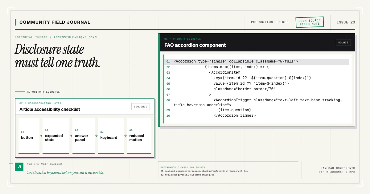
An FAQ block looks simple because its visual vocabulary is familiar: question, chevron, answer. The implementation still has several contracts. Editors need a content model that discourages a dumping ground. Readers need real buttons, visible focus, truthful expanded state, and answers that remain available without fragile animation.
Accessibility here is not an extra component feature. It is the relationship between the Payload schema, DOM semantics, keyboard behavior, state, motion, and tests.
It is also an editorial quality. A precise question, a self-contained answer, and a predictable control reduce cognitive work for everyone. Semantic implementation cannot rescue vague content, and polished content cannot rescue a control that keyboard users cannot operate. Review both halves together.
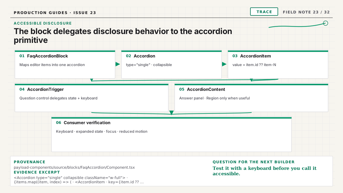
The shipped FAQ Accordion block composes the local accordion primitive rather than reimplementing its keyboard handling, expanded state, or motion. Those are behaviors to verify in the installed application and in the primitive's tests. The block supplies content and styling; an answer panel only needs region semantics when that landmark would genuinely help navigation.
Begin with questions worth answering
An FAQ should resolve repeated uncertainty, not absorb every paragraph that did not fit elsewhere. Each item needs a concise question and an answer with enough context to stand alone. Grouping can help when the page covers several domains, but too many categories may indicate the content belongs in documentation.
A practical Payload model has section-level heading and description fields plus an array of items:
{
  name: 'items',
  type: 'array',
  labels: { singular: 'Question', plural: 'Questions' },
  fields: [
    { name: 'question', type: 'text', required: true },
    { name: 'answer', type: 'richText', required: true },
  ],
}
Use rich text only if answers genuinely need links, lists, or emphasis. A textarea is easier to render and constrain for short answers. Do not accept raw HTML as a shortcut.
The component catalog includes accordion, split, grouped, card, icon, and grid FAQ structures. Choose the structure that matches content organization rather than exposing all of them through one block.
Use a button for disclosure
The question control changes UI state, so it is a <button>. It is not a link unless activating it
navigates. Native buttons already participate in tab order and respond to Enter and Space. Rebuilding
that behavior on a <div> adds work and usually misses something.
Place the button in a heading when each question introduces its answer:
<h3>
  <button
    aria-controls={panelId}
    aria-expanded={open}
    id={buttonId}
    onClick={() => setOpen((value) => !value)}
    type="button"
  >
    {question}
  </button>
</h3>
Choose the heading level from page context. The reusable block can render item headings at a documented level or accept a level through a safe component API. Do not choose a heading merely for its default font size.
Connect state to the answer
aria-expanded belongs on the control and must match visual state. aria-controls points to the
answer panel ID. Stable IDs can come from React useId combined with item identity; do not generate
random values during every render.
The answer region can use aria-labelledby to reference the question button when a named region is
useful. Avoid assigning role="region" to dozens of small panels, which can overwhelm landmark
navigation. The disclosure pattern does not require every answer to become a region.
When closed, the answer should be consistently unavailable visually and to focus navigation. The
HTML hidden attribute is a robust baseline. If animation requires a mounted panel, manage
visibility, focusable descendants, and accessible state carefully; opacity alone leaves hidden links
tabbable.
Choose single or multiple expansion deliberately
An accordion often restricts the interface to one open answer. Independent disclosures allow many. Neither is automatically more accessible. Choose based on comparison and reading needs.
If only one can remain open, opening another should close the previous item without moving focus. Do not collapse the current item merely because the reader tabs elsewhere. If many answers contain related details users may compare, simultaneous expansion can be more useful.
The Payload content model does not need a per-item open state; that is transient UI. A section-level option such as “allow multiple” can be justified when editors understand the behavioral difference, but a site-wide component convention is simpler.
Keep keyboard behavior predictable
Native buttons provide Tab, Shift+Tab, Enter, and Space behavior. Some accordion design patterns also support Arrow Up, Arrow Down, Home, and End between headers. Those keys are optional for a basic disclosure group. If you implement them, manage focus without preventing normal page navigation or screen-reader commands.
Do not trap focus inside an answer. When a panel closes while focus is inside it, move focus to the controlling button before hiding descendants. In most designs, the panel only closes through its own header, so focus is already safe.
Visible focus must meet contrast requirements on every background and state. A hover-only chevron change is not a focus indicator.
Animate the panel without hiding the contract
Height animation is awkward because content height is dynamic. CSS grid-row techniques, measured height, or a small disclosure primitive can work, but the final semantic state matters more than the effect.
Respect prefers-reduced-motion. Reduced-motion users should receive the open or closed result
immediately. Never delay aria-expanded until an animation finishes; assistive state should update
with the action.
Avoid animating from height: 0 while leaving overflowing focusable content active. Test links and
buttons inside answers. The motion guide expands on final-state
rendering and compositor-friendly effects.
Render rich answers safely
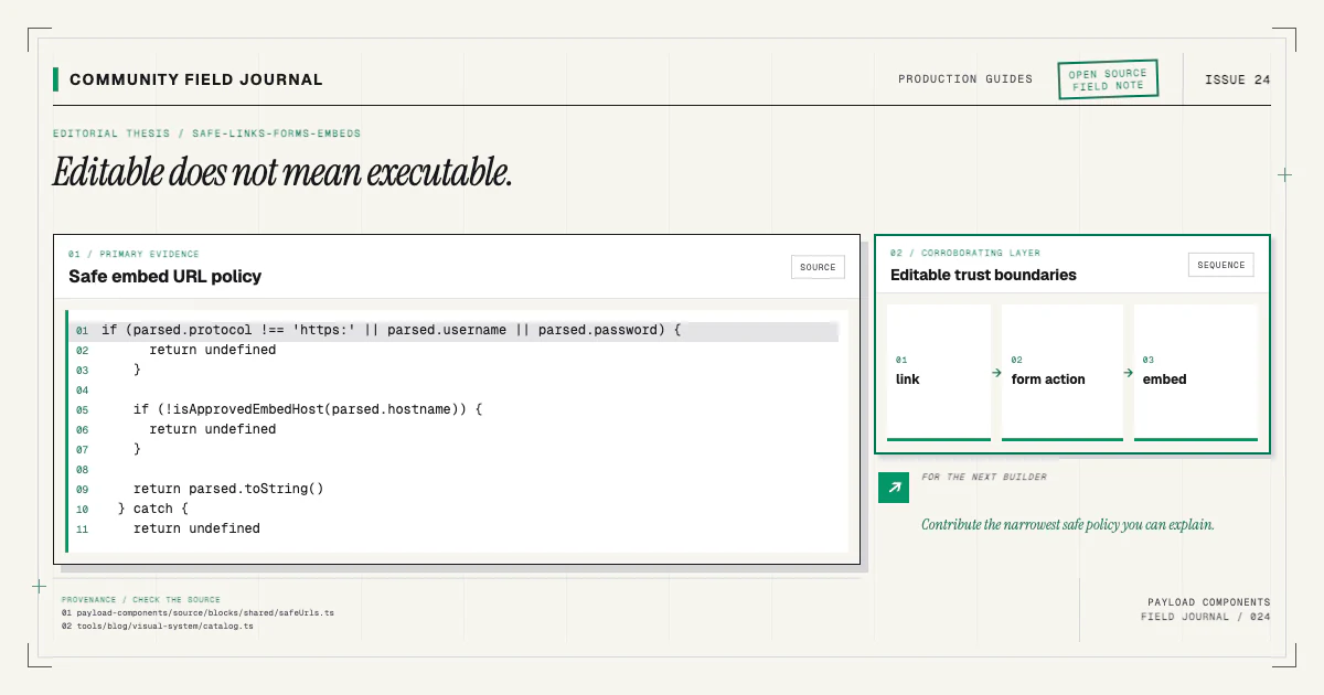
Use the application's Payload rich-text renderer with an allowed feature set. Sanitize or constrain any custom HTML conversion according to the trust model. Internal and external links should go through the shared link policy described in Safe Links, Forms, and Embeds.
Preserve paragraphs and lists; do not flatten an answer into one div because the preview was short.
Ensure link focus is visible inside the panel. If an answer embeds media or forms, reconsider whether
FAQ is the correct content structure; complex interaction hidden in a disclosure can be hard to
discover.
Make the demo twin noninteractive
The live catalog preview mirrors visual classes but is not the production interaction. Demo twins in
this repository remain aria-hidden, contain no real headings, and avoid buttons or links. Static
open and closed-looking rows demonstrate the design without adding duplicate keyboard targets to the
catalog card.
The installable source contains the real semantics and behavior. Class-mirror tests keep visual tokens aligned between source and twin. The demo-twin article explains this architecture boundary.
Test behavior, not just snapshots
A visual baseline can catch a shifted border or spacing regression, but it cannot prove disclosure semantics. Add interaction tests that:
- Tab to each question button.
- Toggle with Enter and Space.
- Assert
aria-expandedchanges. - Assert the controlled panel becomes available or hidden.
- Verify focus does not enter closed content.
- Exercise optional arrow-key behavior if implemented.
- Confirm long rich answers and internal links work.
- Run with reduced motion.
Include automated accessibility checks, then test with keyboard and at least representative screen- reader behavior. Automated rules catch invalid attributes and missing names, not whether the interaction is understandable.
Test one item, many items, long questions, translated text, and zoom. Ensure chevrons do not overlap the label and the page never overflows horizontally.
Install and adapt the full contract
Choose an accordion when hiding answers helps scanning. Choose a grid or card structure when answers are short and should remain visible. Install the structure, inspect its Payload fields and React source, and run it with real content:
npx payload-components add faq-accordionReview the FAQ Accordion docs and verify the result in your own page heading hierarchy. If you find a keyboard, focus, rich-content, or long-text state the component does not handle, contribute the failing test with the fix through the contributing guide. An FAQ block is finished when the questions remain easy to author and the answers remain easy to reach—regardless of how a reader operates the page.