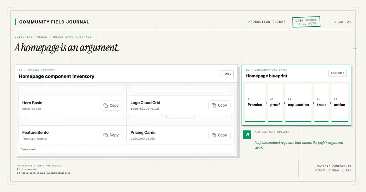
A complete SaaS homepage is not a stack of every section in the catalog. It is an argument. The hero makes a promise, proof makes that promise credible, features explain the mechanism, integrations reduce adoption anxiety, pricing frames the commitment, FAQ resolves remaining objections, and the final action gives the reader a clear next step.
Every section must earn its place.
Payload blocks make that argument editable without turning the page into an unrestricted visual builder. Each section has a focused content contract and React implementation. Editors control the sequence and content; the application preserves design, accessibility, and type safety.
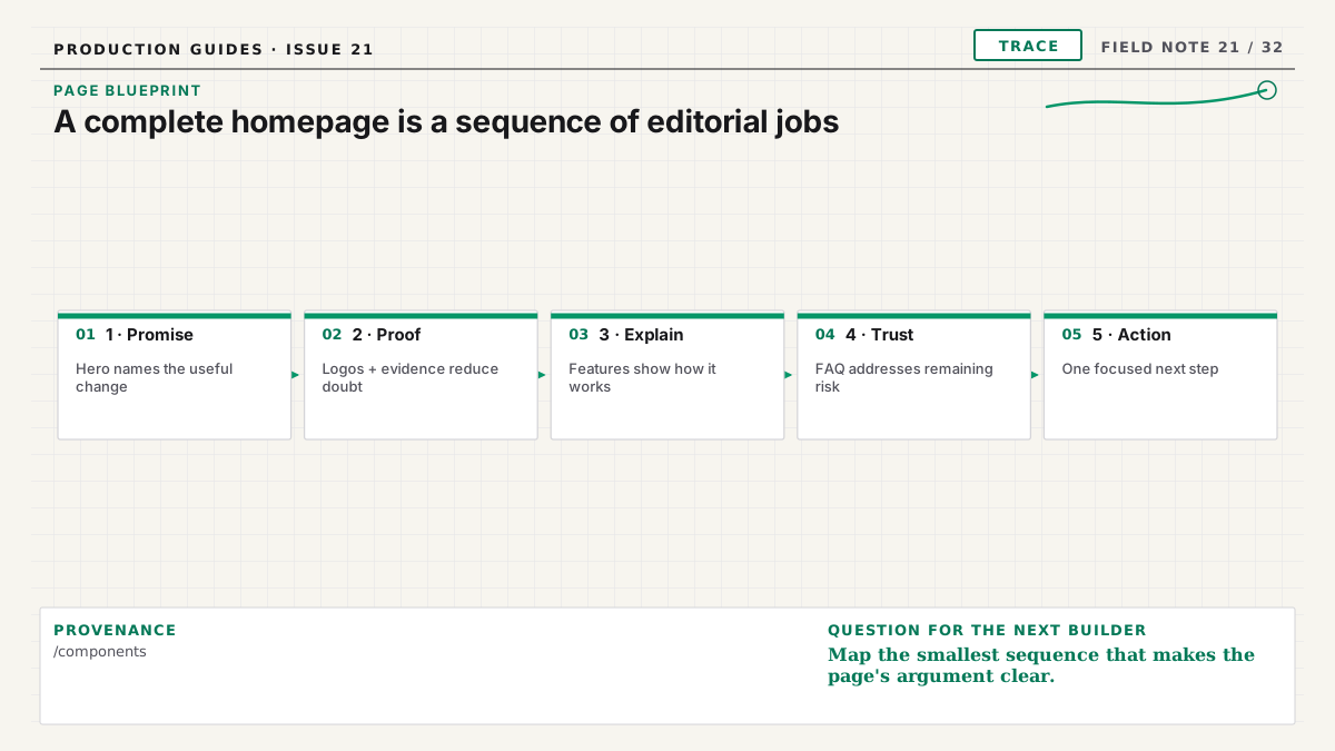
Plan the argument before installing components
Write one sentence for each section's job. A practical first outline is:
- Hero: state the audience, outcome, and primary action.
- Logo cloud or testimonial: establish relevant adoption or a concrete result.
- Feature structure: explain three to six mechanisms behind the outcome.
- Integration section: show how the product fits the reader's environment.
- Deeper content or comparison: make differentiation specific.
- Pricing: explain the next level of commitment honestly.
- FAQ: answer questions that genuinely delay action.
- CTA: offer the next step after the reader has context.
Remove any section whose sentence repeats another. A shorter page with distinct jobs is more useful than a long page that restates the hero six ways.
The first landing-page guide covers the basic editor-to- frontend loop. Here we will focus on a larger composition and the joins between families.
Select structures from real content
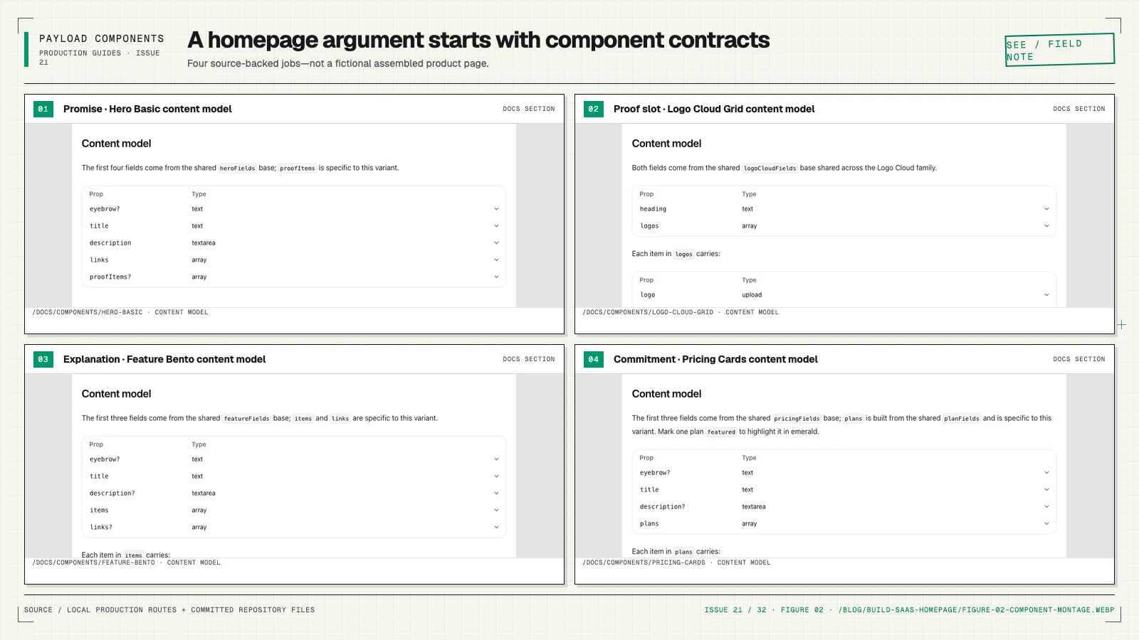
Browse the component catalog with draft copy beside you. Use hero-basic when the
message and action can lead. Choose a logo grid when readers need to inspect names, or a restrained
marquee when volume is the point and motion remains optional. Use a feature grid for peers, steps for
a process, split rows for product evidence, and bento only when a few ideas deserve unequal emphasis.
For integrations, decide whether the reader needs breadth, connection workflow, or a featured partner story. For pricing, distinguish equal plans from an enterprise narrative. For testimonials, choose a grid for breadth or a spotlight for one detailed outcome.
Do not use structural variants as cosmetic themes. The guides on feature sections and social proof provide content-model criteria.
Install in narrative order
Work on a clean branch. Install one component at a time so each wiring diff remains easy to review:
npx payload-components add hero-basic
npx payload-components add logo-cloud-grid
npx payload-components add feature-bento
npx payload-components add integration-grid
npx payload-components add testimonials-grid
npx payload-components add pricing-cards
npx payload-components add faq-accordion
npx payload-components add call-to-action-centered
These are examples from the current registry, not a requirement to use all eight. Each command delivers source, installs public requirements, patches the supported Pages and RenderBlocks anchors, runs Payload generators, and records state. Read every diff before continuing.
Run npx payload-components doctor after the sequence. It should report healthy files and fragments.
If one stage failed, fix that project-level error and rerun the same component command; the installer
is designed to converge.
Build the Page collection contract
The installer's collection patches add block configs to the existing layout Blocks field. Review
the final list for readable chooser order and labels. Grouping related entries in source can help
maintainers, but the editor's saved array controls public page order.
Use the collection's normal versions, drafts, localization, access, and preview configuration. Blocks do not create a parallel publishing system. Ensure the frontend fetch explicitly chooses draft or published content, locale, depth, and access behavior.
Generate types after the final config. The Page layout should become a discriminated union containing every installed slug. Search the generated file for each new member. Avoid casts in the renderer that would hide a missing union member.
Keep RenderBlocks explicit
The final map is longer, which makes clarity more important:
const blockComponents = {
  heroBasic: HeroBasicBlock,
  logoCloudGrid: LogoCloudGridBlock,
  featureBento: FeatureBentoBlock,
  integrationGrid: IntegrationGridBlock,
  testimonialsGrid: TestimonialsGridBlock,
  pricingCards: PricingCardsBlock,
  faqAccordion: FaqAccordionBlock,
  callToActionCentered: CallToActionCenteredBlock,
}
Keep imports and keys boring. Report an unknown blockType during development. Preserve stored IDs
as React keys and pass wrapper props consistently. The detailed
type-safe rendering guide shows a mapped-type pattern.
Most sections can remain server components. Keep interactive islands—FAQ disclosure, a form, or
optional carousel—small instead of moving the whole page behind use client.
Author with transitions in mind
Enter real content early. A section that looks polished with fixtures may be redundant or awkward in the page argument. Read the headings alone; they should tell a coherent story. Then read the final sentence of one section beside the next heading. That transition often reveals repetition.
Vary section density deliberately. Two card grids back to back can feel like one endless matrix. Follow a dense feature group with a focused quote or split story. Alternate backgrounds only when the change communicates grouping; decorative striping can make editor reordering brittle.
Use one h1 in the page hero and logical h2 headings for major blocks. Component demos avoid real
headings because they are decorative previews; installed source must use semantic structure in page
context.
Handle links, media, and forms safely
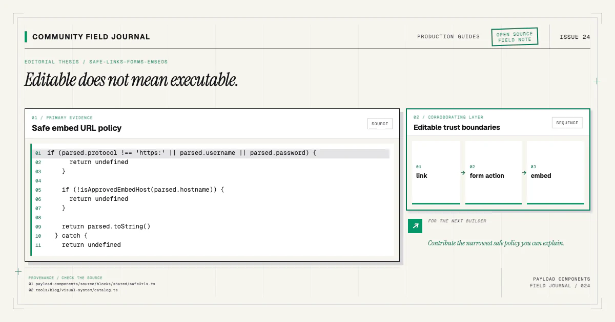
Use the project's shared link model for internal references and allowed external URLs. Validate protocols. A CMS field should not be able to emit arbitrary script URLs or raw embed HTML. The safe-input guide covers the boundary.
Reserve image dimensions and provide an alt-text policy. Product screenshots should remain legible at responsive sizes. Decorative media can use empty alt text when it adds no information. Upload relationships may be IDs depending on fetch depth; narrow them in React.
If the final CTA contains a signup form, submit to a trusted server action or route with schema validation, access decisions, rate limiting, and CSRF protection appropriate to the application. Do not treat a component field as server-side validation.
Make motion optional
Marquees, orbits, and entrance transitions can support hierarchy, but the page must communicate without them. Render meaningful content in the DOM before animation. Use transform and opacity, reserve layout space, pause nonessential continuous motion, and provide a reduced-motion final state.
Test the complete page with prefers-reduced-motion: reduce. No transcript, logo, or action should
remain hidden because its animation did not run. The motion article
provides an implementation checklist.
Test the composition, not only components
Component baselines protect isolated previews. The homepage needs its own browser coverage:
- no horizontal overflow from 320 pixels upward;
- one clear
h1and logical heading order; - visible focus on every link and control;
- no nested interactive targets;
- long headings, missing optional media, and maximum arrays;
- draft and published data paths;
- reduced-motion completeness;
- stable image dimensions and acceptable loading behavior;
- mobile and desktop visual snapshots for intentional layout change.
Run lint, typecheck, integration tests, the production build, and browser tests. Open the admin and reorder sections. The page should remain coherent when proof moves after features or FAQ disappears. If it only works in one locked sequence, the blocks are not as composable as they claim.
Ship a page your team can keep editing
Before launch, remove fixture claims, verify proof and pricing, check every destination, and document which content has an external source or review date. Use Payload drafts for editorial review. Keep the installed source changes in the same pull request as the page integration so reviewers see the whole contract.
Then share what you learned. A real SaaS homepage can expose missing array states, awkward chooser labels, or a component transition no isolated demo reveals. Bring a sanitized reproduction through the contributing guide. The registry improves when complete pages feed their hard-won details back into components, docs, and tests.