Social proof works when it helps a reader evaluate a claim. A recognizable organization can show adoption. A detailed testimonial can show an outcome in context. A rating can summarize a real source. A quotation can reveal how a person experienced the product. Without provenance, those same elements are decoration dressed as evidence.
A good Payload model makes proof maintainable and attributable. The component gives the evidence a clear hierarchy without inventing credibility the content does not contain.
Before designing a section, write a tiny evidence ledger: the exact claim, the source that supports it, the person responsible for verification, and the date it should be reviewed. That ledger may live in editorial fields, internal notes, or the team's publishing process. The important part is that a reusable component does not turn temporary evidence into permanent-looking truth. Easy CMS editing should shorten the correction path when a role, rating, organization relationship, or result changes.
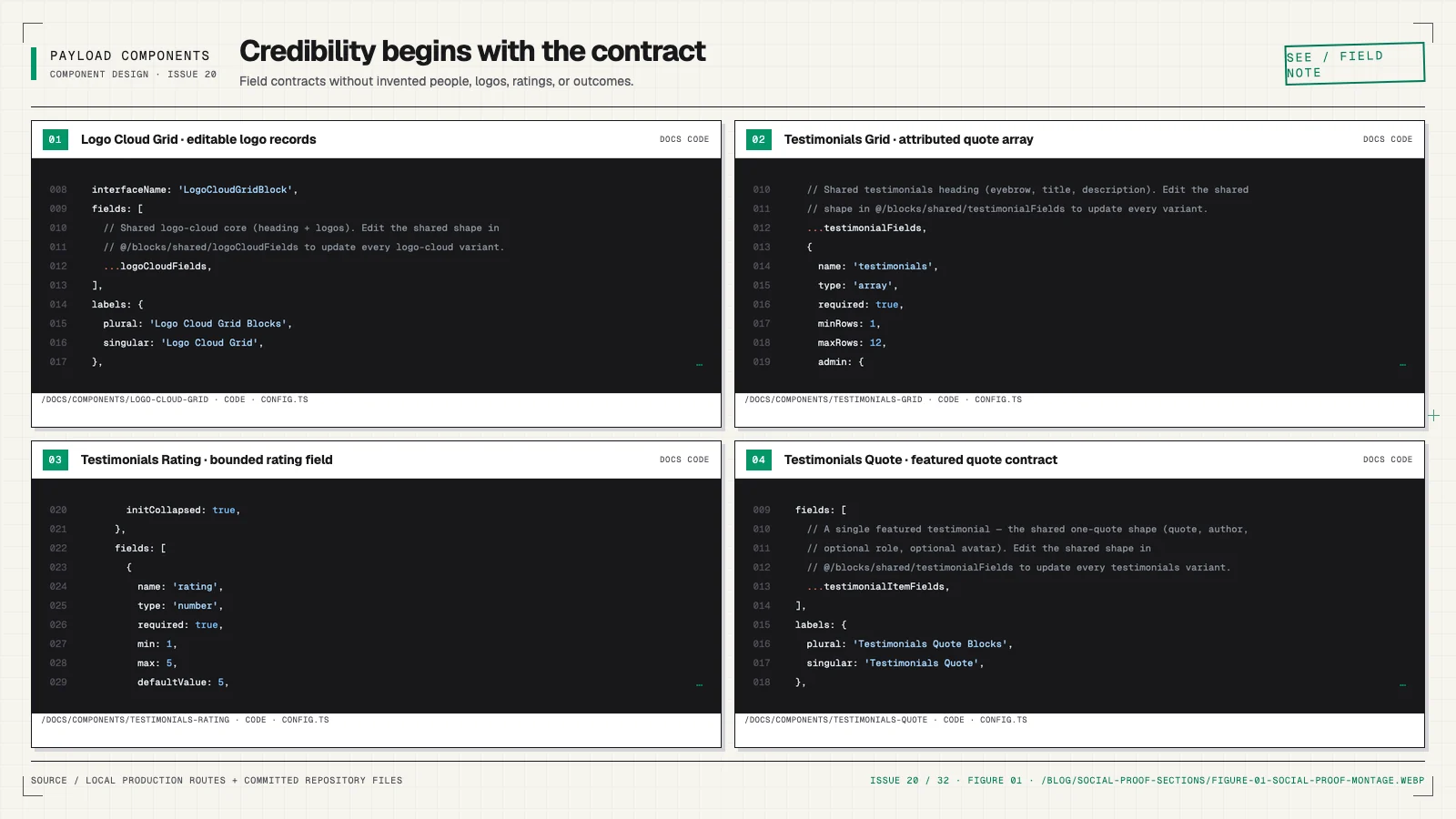
Match the proof to the claim
If the page claims broad adoption, a logo cloud can provide a compact signal. If it claims a workflow saves time, a testimonial with the person's role and specific outcome is stronger. If it claims high satisfaction, a rating needs a source, scale, count, and date context.
Do not stack every proof type merely because components exist. Choose the evidence that resolves the reader's real uncertainty. One attributed, specific quote can be more persuasive than twenty logos with no explanation.
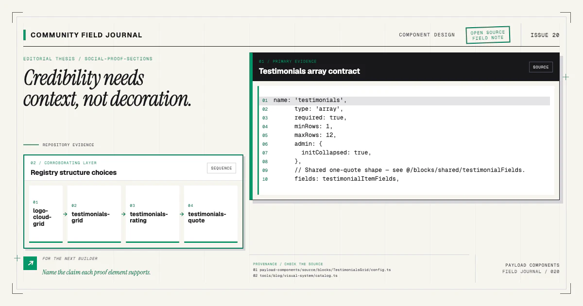
The component catalog includes logo-cloud and testimonial families with distinct structures. Their variety is a set of narrative tools, not a checklist for one page.
Model logos with permission and context
A logo item usually needs an image relation, organization name, optional URL, and accessible text. The file itself may include visible lettering, but its alt text should name the organization rather than describe every shape. A decorative repeated logo can use empty alt text when adjacent text already supplies the name.
Store enough context to manage usage rights and removal. The public block does not need to expose an internal permission record, but the editorial workflow should know why the logo may be displayed and who can approve changes.
Avoid implying endorsement through placement or copy when the relationship only proves compatibility or historical use. Section headings such as “Works with” and “Used by” make different claims.
For marquees, render a complete readable list without motion first. Duplicate visual tracks should be hidden from assistive technology, and reduced-motion users should receive a stable presentation. A grid is often the better choice when every logo needs equal inspection.
Give testimonials real attribution
A testimonial model can include quote, name, role, organization, portrait, and optional source link. Require the quote and enough attribution to make it meaningful. A first name and generic avatar do not establish credibility.
Keep the quotation as text or rich text, not pre-styled HTML. The component owns quotation marks,
typography, and <blockquote> semantics. Use <cite> or adjacent attribution markup appropriately;
do not put the person's name inside the quoted sentence merely to achieve a visual layout.
If an editor shortens a quote, establish a policy for indicating edits and preserving meaning. The CMS makes updates easy, which increases the importance of review rather than reducing it.
Test missing portraits. A credible quote should not collapse because the optional image is absent.
Treat ratings as structured evidence
A row of five star icons is ambiguous without a numeric value, maximum scale, source, and sample size. Model those values explicitly when the section makes a rating claim:
{
  name: 'rating',
  type: 'number',
  min: 0,
  max: 5,
  required: true,
}
Add fields for ratingScale, reviewCount, sourceLabel, sourceUrl, and an “as of” date when the
claim can change. Render a text equivalent such as “4.8 out of 5 from 240 reviews.” Icons can support
the value but should not be the only representation.
Do not round visually to five stars while the accessible text says 4.2. Decide a consistent partial rating treatment or use a simpler icon plus exact number.
Use structural variants for emphasis
testimonials-grid, testimonials-bento, testimonials-wall, testimonials-rating,
testimonials-spotlight, and testimonials-quote allocate attention differently. A grid presents
peers. A spotlight centers one story. A wall conveys volume. A rating combines summary evidence with
supporting voices.
These are structural choices with different item counts and content expectations. Keep them as named
variants instead of a layout dropdown on one block. The
component variant guide explains why the catalog
is the selection surface.
If multiple variants share attribution fields, ship those definitions through a real shared module as described in sharing Payload fields.
Make carousels earn their interaction
A rotating testimonial carousel can reduce the amount of content visible at once, introduce controls, and hide evidence behind timing. Use one only when the interaction serves the content and its accessibility behavior is complete.
Controls need accessible names, keyboard operation, visible focus, and stable order. Automatic rotation needs pause behavior and should respect reduced motion. Content should remain available when JavaScript fails. Avoid changing slides while a reader is interacting with one.
Often a responsive grid, spotlight plus supporting cards, or horizontally scrollable list is easier to understand and maintain.
Keep links and external sources safe
Source links, organization sites, and case studies are editor-controlled destinations. Validate protocols and use the application's shared link renderer. Open new tabs only when there is a clear reason, and communicate that behavior accessibly.
Do not accept arbitrary embed HTML for third-party review widgets. Use an allowed provider and identifier, then render through a controlled component. The safe input guide explains this trust boundary.
External evidence can disappear or change. Store the text and attribution needed to understand the claim while linking to the source where appropriate. Establish a periodic review for ratings and time-sensitive metrics.
Design for uneven content
Real quotes have different lengths. Roles wrap. Organization names are awkward. Portraits have mixed ratios. Test those states rather than truncating every quote to match a card grid.
For a wall or grid, CSS masonry can create a visual order that differs from DOM order. Preserve a logical reading sequence. Avoid clipping a quotation without a clear route to the full text. Ensure cards grow with text zoom and translated content.
Logo sections need sufficient contrast and recognizable size. Forcing every mark to one color may violate brand usage or make details illegible. Use a deliberate media pipeline and retain originals with appropriate permission.
Build a reviewable content workflow
Use Payload versions and drafts so proof changes can be reviewed. Define who verifies quotes, names, roles, logo permission, ratings, and outcome claims. A component can validate required fields, but it cannot determine whether a statement is honest.
Keep source dates and internal notes in the content workflow when useful, even if the public component does not display them. Make removal fast when a person or organization withdraws consent.
Install a structure that matches the evidence you actually have:
npx payload-components add testimonials-gridRead the Testimonials Grid docs, replace every fixture with verified content, and test missing portraits and long quotes. If your real proof needs a structure the family lacks, contribute the content model and provenance rules alongside the visual idea through the contributing guide. Credibility comes from the evidence and its care; the component's job is to present that care clearly.